Technology has come to a point where our hand held devices will take precedence over our desktop computer, says experts. but don’t know if this is happening, will happen soon or within few many years or if the experts really know anything. Based on Analytics and Adsense revenue, mobile traffic seems to be a very tiny percentage. But somehow Google figured out something again to cause pain in every webmasters ***, I am going to say head. That is they call it mobile-friendly algorithm update from Google. As of April 21 2015, “mobile-friendly” design of a website is considered as a ranking signal. If your site is not mobile-friendly, you will lose your ranking. Yeah, “you better follow me or go to hell” says God of Internet.
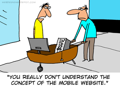 hm hm, that’s not a mobile site.
It’s really a daunting task if you have a custom programmed website and if you need to optimize it for mobile or hand held devices of any kind that can access internet. According to an independent study, it seems over 60% of sites are not mobile-friendly. But if you are running a CMS like Joomla, or blogging platform like WordPress then you can provide a mobile version of your site very easily. Some of the responsive templates that you may have, does the job neatly already. But in case if you don’t have a mobile friendly template for wordpress do not worry.
Mobile friendly Website in few steps.
You no need to disturb the current template or design that you have used so far. All you need is a plugin, that chooses the template for all kinds of mobile devices. All you have to do is these few steps. ( wordpress only ).
1. Install Any Mobile Theme Switcher wordpress plugin, although there are similar plugins, this is simple and easy, free version of the plugin will do.
2. Install a mobile friendly wordpress theme. Do not change the theme you are running currently for the desktop version, just install. I would recommend Mobius theme, You can download it here, It has good number of features, easy for customization and it’s free.
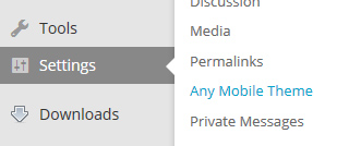
3. After installing the theme select Settings->Any Mobile Theme, from your wordpress dashboard.
4. Now you select the Mobius theme or any similar theme you have installed ( in step 2 ), from the drop down list for all devices.

And that’s it, sorry if you expected more steps. After this you will have a mobile version, while your actual theme that you are running earlier for desktop will remain the same. Now you can test your mobile site and customize the color, background as you like.
You can test your mobile site here. Mobile-friendly-test. If you pass, pass it on to every friend.